By Marketing
We founded Loft Orbital in 2017 to shift a paradigm around space infrastructure. Fast forward to 2024, we’ve achieved many milestones in our mission to build the space infrastructure that lets any company, government or institution harness the benefits of space. These milestones include launching multiple satellites, establishing three global offices, and deploying over 10 missions across our infrastructure. This year, we embarked on a slightly different kind of program: building a new brand identity to reflect our growth, where we are, and where we’re going.
Our original brand was created like many start-ups: with a logo from 99designs and a simple color palette. After that, our team focused on deploying missions for our customers – which was far more critical to the future of the company. As we grew, we recognized an updated brand would complement our team’s achievements, a unified design system would support our growth, and a differentiated identity would drive external recognition of Loft in an industry that is changing fast.
What’s New
This new identity is more cohesive and consistent and showcases the versatility of Loft’s platform. With our refreshed logo, color palette, and design elements, we’ve crafted each aspect to reflect our mindset and high standards.
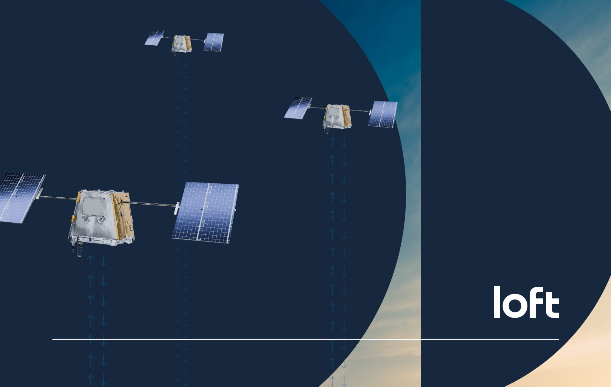
- Logo design: Our logo is our name by design, and is something that is simple, adaptable and timeless. This deliberate choice embodies the simplicity at the core of our brand identity. By using a clean, straightforward logotype, we visually communicate our commitment to uncomplicated solutions and transparent practices.
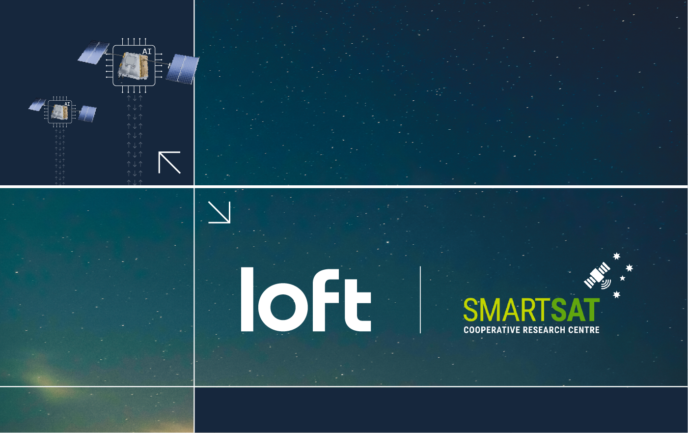
- Clouds: In building Loft, we’ve drawn a lot of inspiration from the cloud infrastructure industry. We admire how cloud companies have made access to limitless resources easy and self-serve. The analogy to the cloud is a guiding light for our product philosophy.
- Color: Loft’s visual identity breaks from industry norms with a vibrant, energetic color palette. While competitors often opt for somber, muted tones, we embrace bold hues that reflect our innovative spirit and approachable nature. These colorful choices embody our belief that cutting-edge technology and a playful attitude can coexist, making the future of space infrastructure ambitious and exciting and inviting.
- Visual identity: Inspired by Bauhaus, design elements symbolize our commitment to distilling complex space concepts into clear, functional, and elegant solutions. This influence is visible in our logo’s circular elements, reflecting our commitment to clean, rational design. By blending innovative solutions with accessible design, we honor Bauhaus principles while visually reinforcing our core message: we make space simple.
We’re excited to activate our new brand in a variety of ways, starting with our website. As an integral part of our new identity, our site serves as a primary touchpoint for learning about Loft. Take a second to click around, and let us know what you think!